-
For as long as I can remember I have created hand-drawn lettering - everyone I know shares the baffling experience of receiving a birthday card from me adorned with an illegible new script.
I have no formal grounding in the design of fonts, however, so it is probably a crazily ambitious goal that I have now set myself: to design a different alphabet, every month, for a year.
Apologies in advance to genuine graphic designers for crass errors, accidental plagiarism etc.!
Fonts & Typography
-
![]()
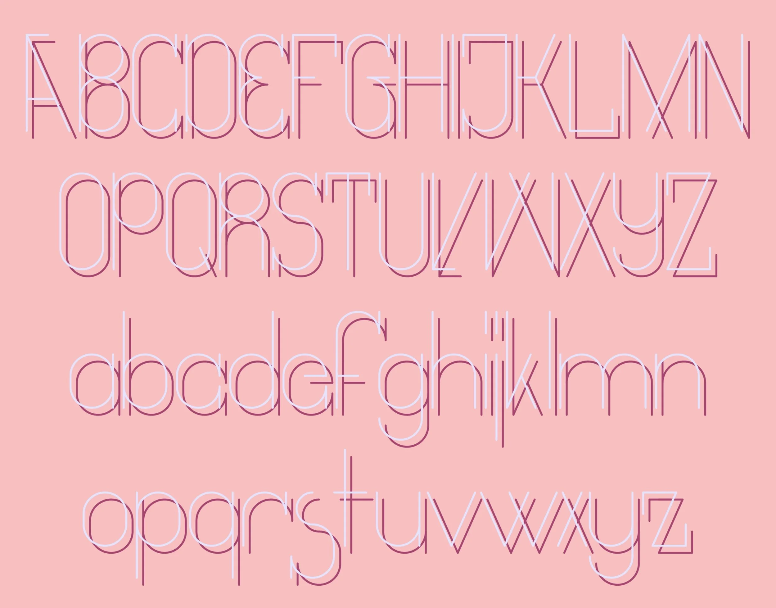
Regular weight - colourway 1
-
![]()
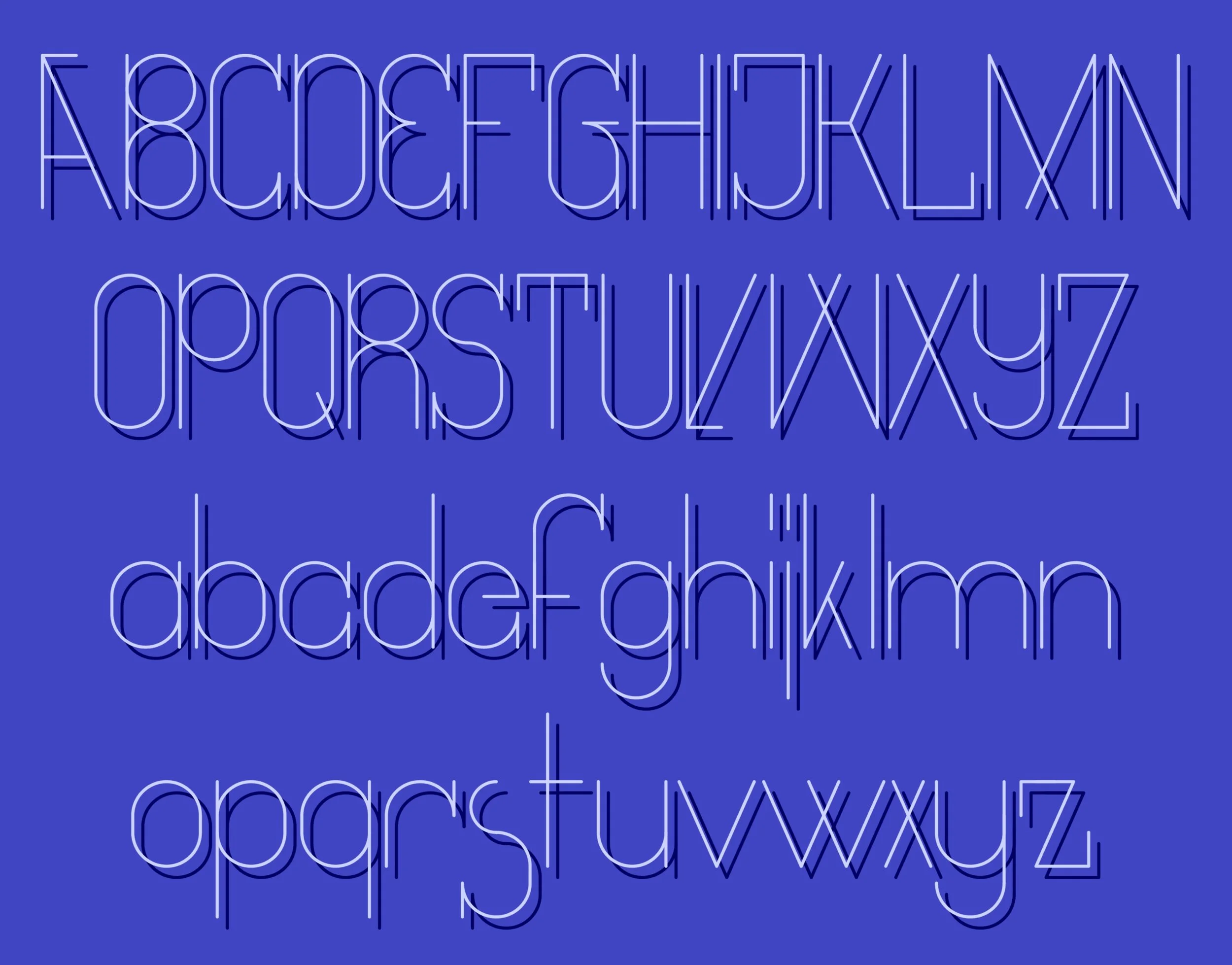
Regular weight - colourway 2
-
![]()
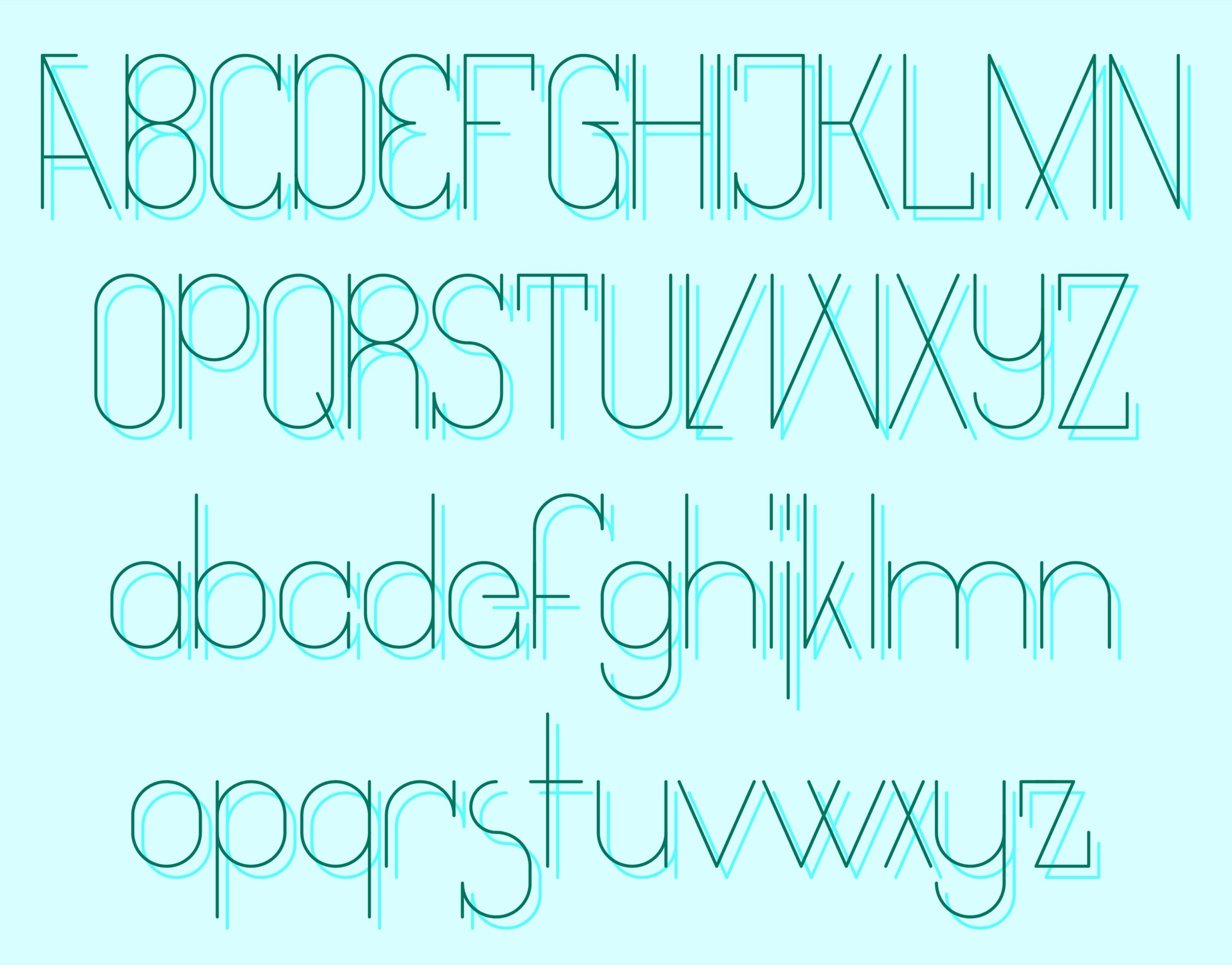
Light / Shadow - colourway 1
-
![]()
Light / Shadow - colourway 2
-
![]()
Light / Shadow - colourway 3

-
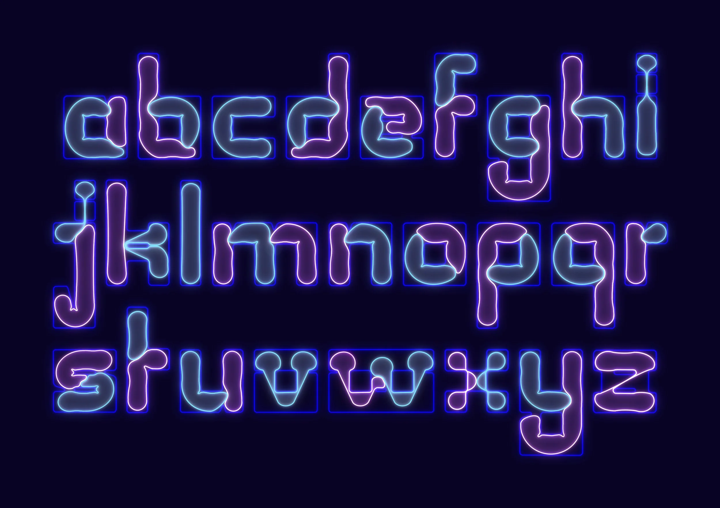
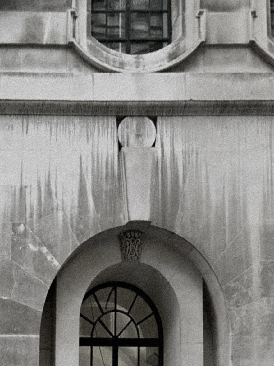
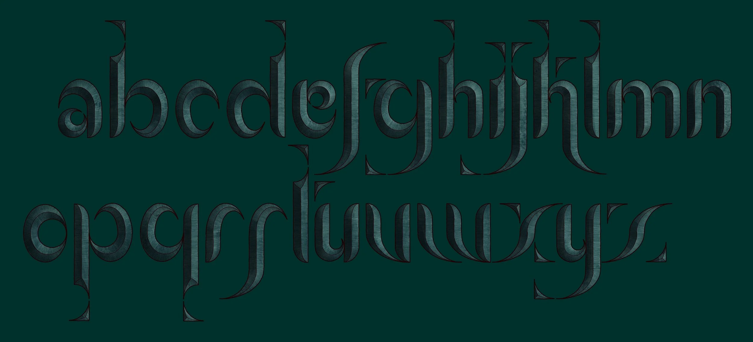
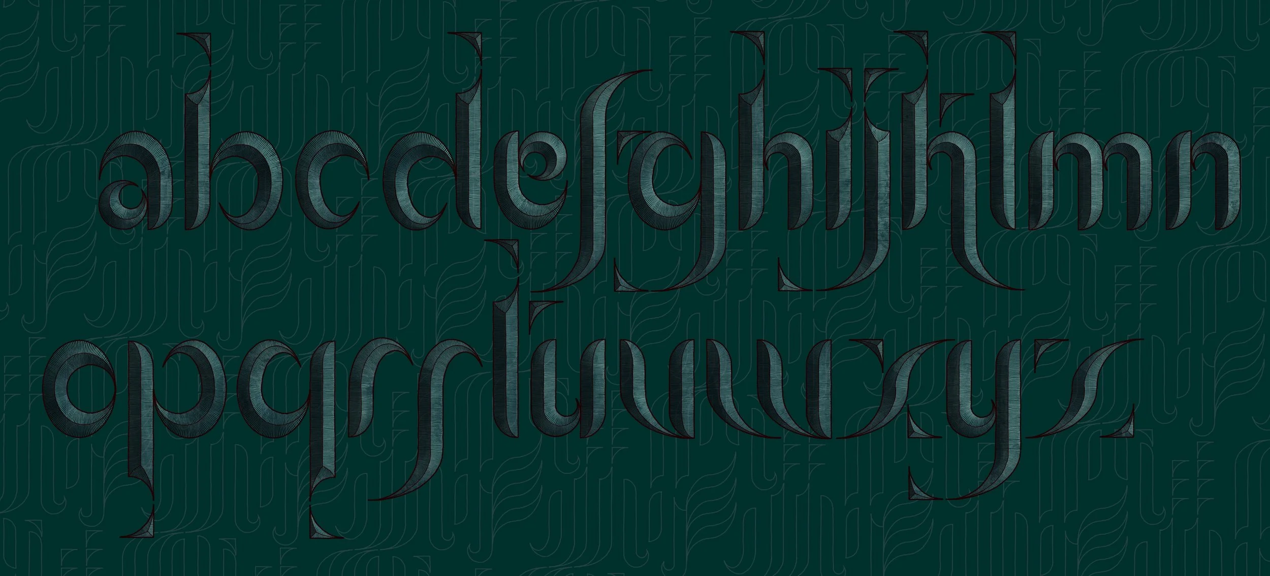
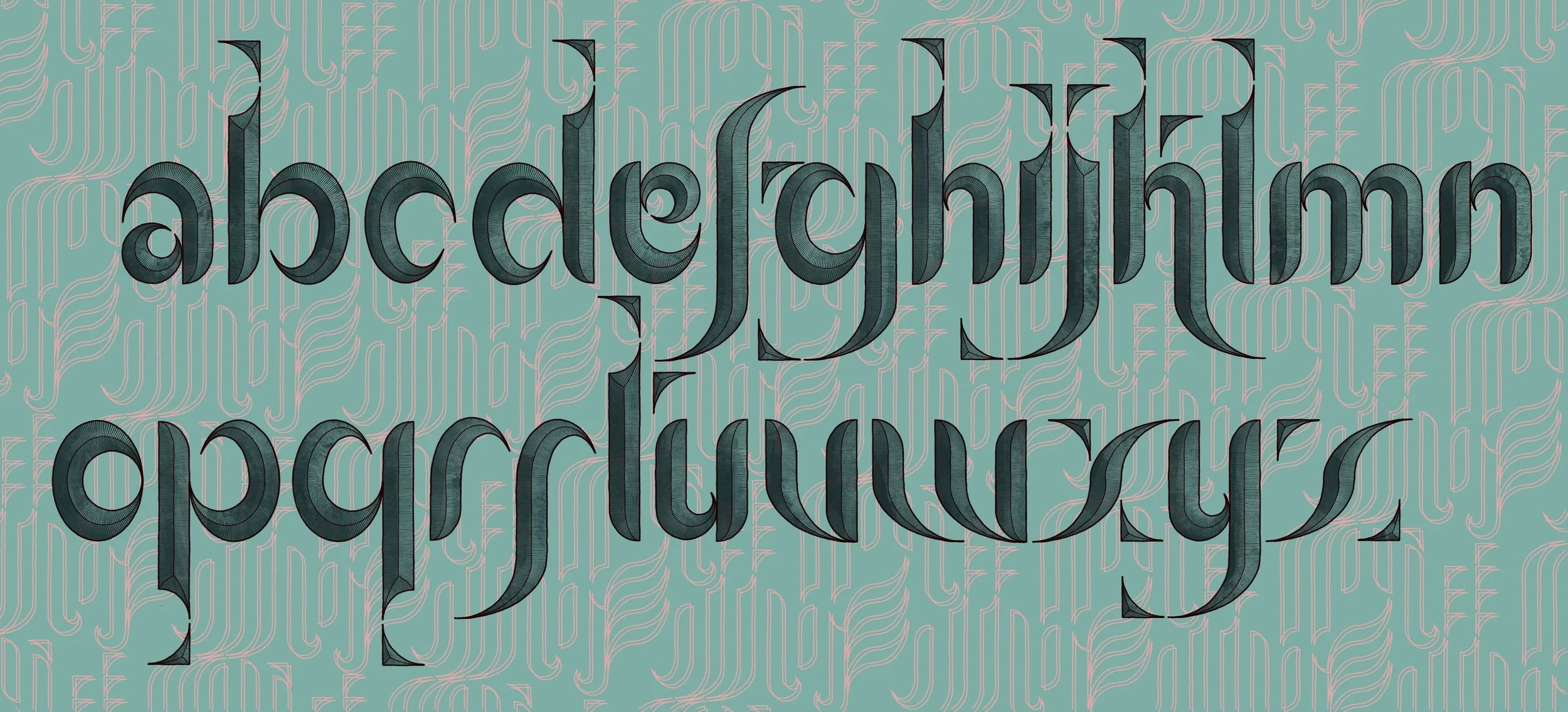
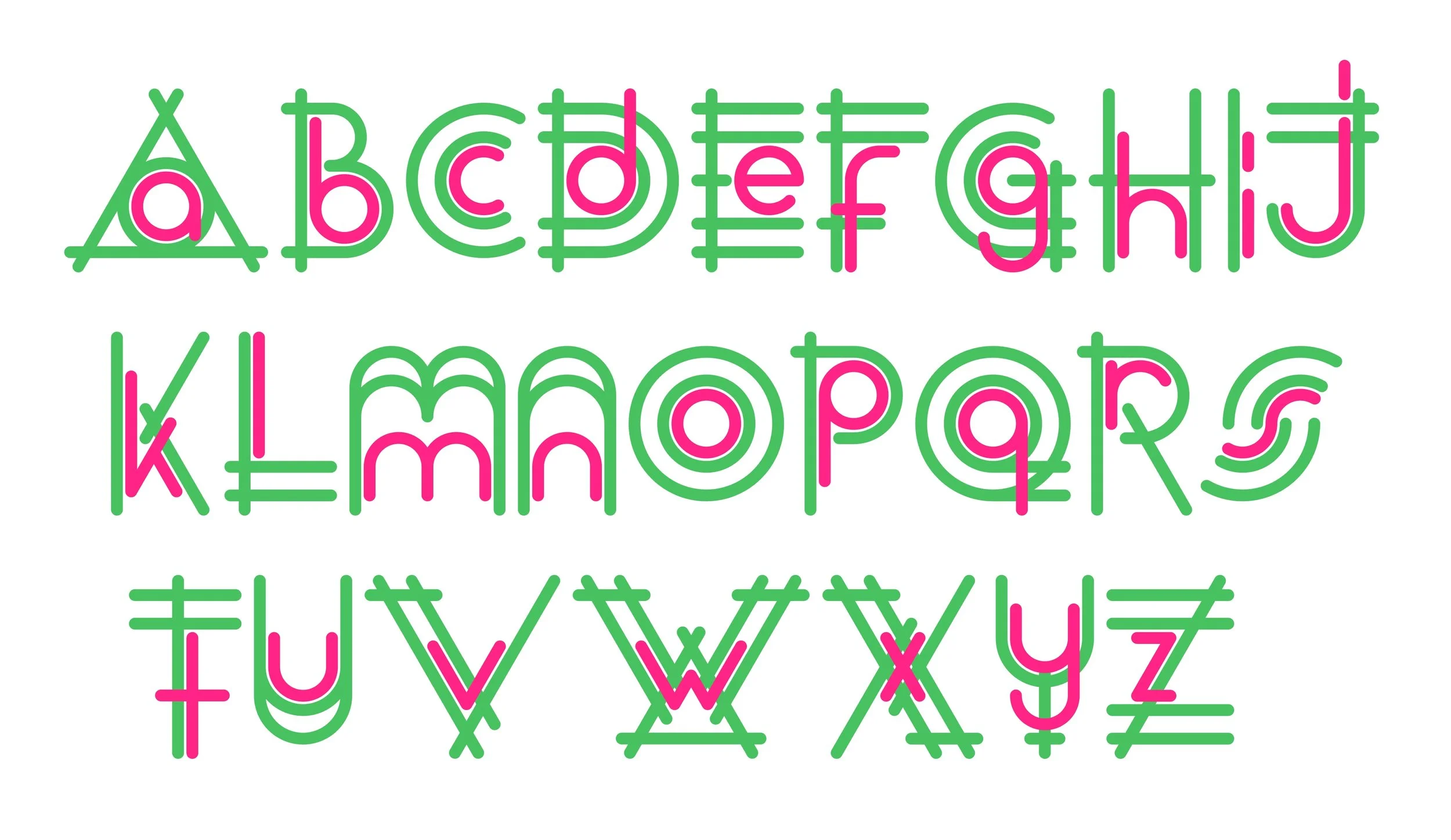
Back in my March entry in this page I noted that inspiration can come from unexpected things. This observation applies equally well to August’s alphabet.
When walking through the City of London I noticed a small detail of the façade of the former Midland Bank branch building in Leadenhall street, designed by Edwin Lutyens. Above the keystone of each arch was a rhomboidal recess, into which was inserted an oval form that fully occupied the width and height of the form that contained it. This seemed to me to create a tension - the oval pushing to expand and escape, the enclosing quadrilateral seeking to prevent this occurring.
This basic concept of curvilinear shapes constrained within a regular enclosure evolved into this font, in which individual letters are animated, squirming and pulsing, struggling to escape the imposed conformity of their environment.
Below right: Lutyens’ Midland Bank, Leadenhall Street, London - the surprising source of inspiration for this alphabet
Below left: neon style!

-
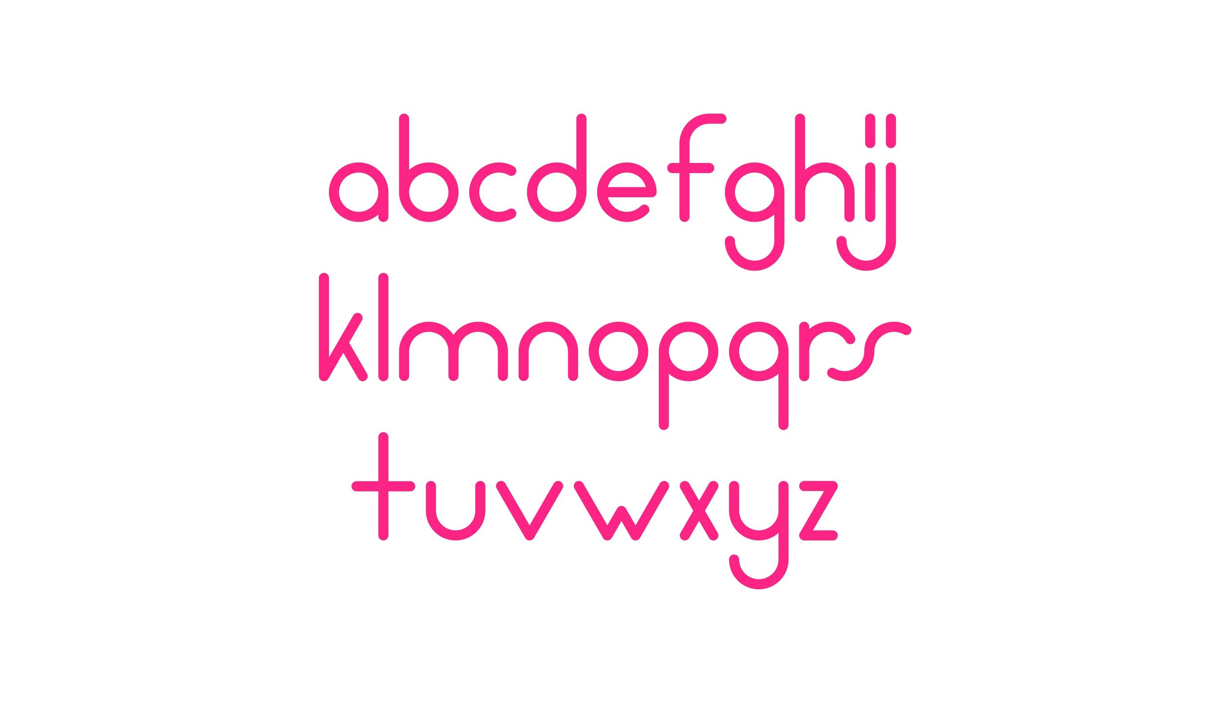
July’s alphabet is an evolution of one such birthday card creation, originally devised a few years ago for one of my oldest friends.
Through this project I am learning that the challenge of developing a complete alphabet is very different from just drawing the letters needed for a short message.
Much greater discipline is required in the design of each character, and how they are spaced, if they are to be able to be combined in any possible sequence and still look coherent.
The purpose of this project is to learn more about the discipline of designing fonts, while at the same time retaining the joy I have always derived from devising bespoke lettering for those I care for, lettering that will leave them saying ‘what on earth does that say? is that an ‘h’?’
Above: alternative colourways
-
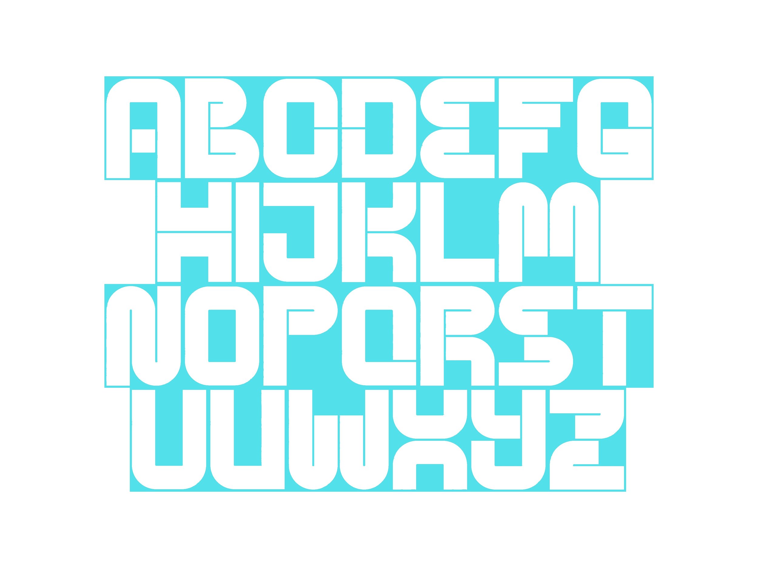
...and designing lower and upper case versions of each letter of an alphabet while ensuring that they truly feel like like a consistent family is especially difficult.
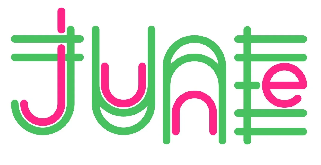
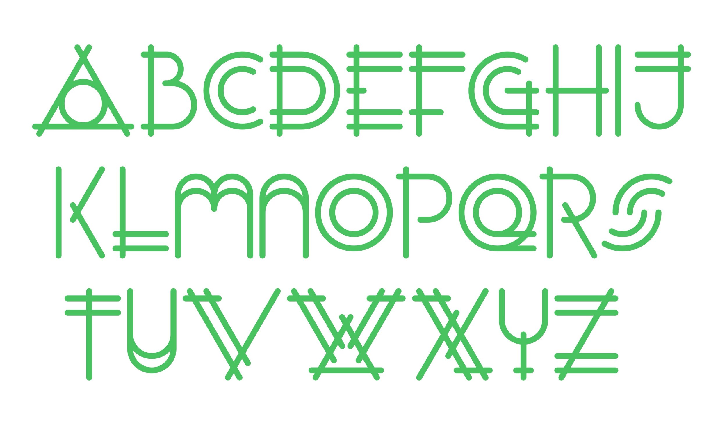
June’s alphabet is an experiment. By embedding the lower case letter geometries within the upper case, this alphabet seeks a coherent character across both upper and lower cases.
-
![]()
Upper case alphabet
-
![]()
Lower case alphabet
-
![]()
Combined lower and upper case alphabet
-
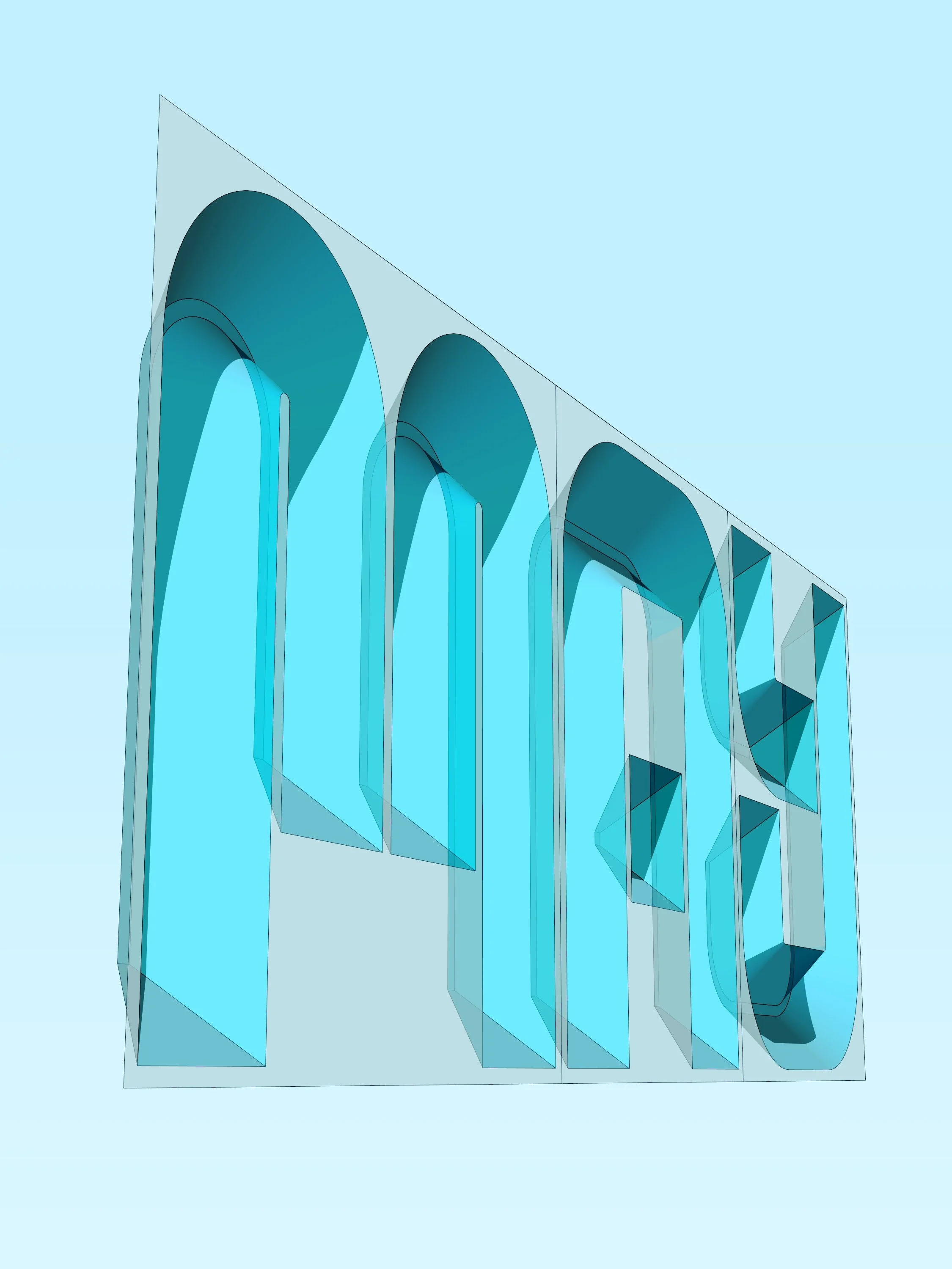
Incised letters carved into the facades of buildings can change dramatically in how they appear through the day depending on sun angle and the strength of the sun.
This alphabet has been modelled in 3D as a test bed for the generation of fonts using this principle.
First, the alphabet was assembled from a intentionally pared back set of components, and then the sun angle was adjusted to test how the character of the letters changed depending on what portion of them was in shadow.
-
![]()
Shadows - Variant 1
-
![]()
Shadows - Variant 2
-
![]()
Without shadows - Variant 1
-
![]()
Without shadows - Variant 2
-
![]()
A 3D view of the letter forms


-
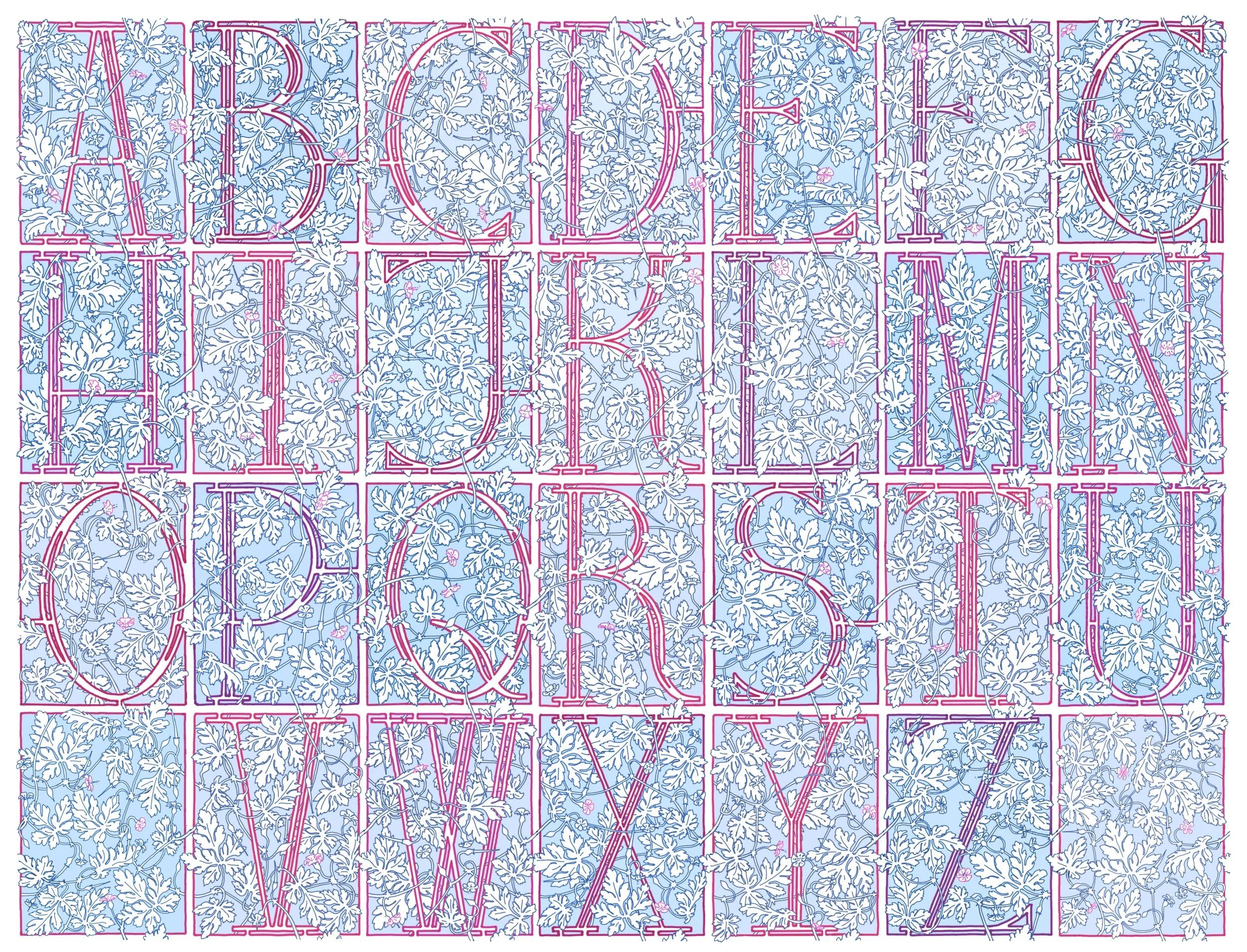
Geranium Robertianum has an image problem. It is an invasive weed, and its unpleasant odour has caused it to acquire the undignified sobriquet ‘Stinking Bob’.
However I was drawn to the delicate tracery of deeply cut leaves springing up in every crack in the paving of my terrace - and identified it as the ideal solution to a very specific decorative purpose.
I set out to devise an alphabet inspired by the plant based designs of the Arts and Crafts movement: the wallpaper and fabric designs of William Morris, or the Ceramics of William de Morgan, but with a key difference. I set out to create a pattern of leaves, stems and flowers that could extend across the junctions between the letter panels seamlessly, and be different in every instance.
Each Stinking Bob leaf is is made up of five sections of different sizes, but all are structured almost identically.
This characteristic made it the ideal plant for my purpose, as leaves of a range of sizes and orientation could be situated at each point of connection, and any portion of the design could abut any other, creating the illusion of a continuous and organic veil of vegetation.
Thank you Stinking Bob!
-
![]()
Upper case alphabet - light palette
-
![]()
Light Palette - detail of letter A
-
![]()
Upper case alphabet - dark palette
-
![]()
Dark palette - detail of letter Z
-
![]()
Geranium Robertianum
-
![]()
Arts and Crafts Precedents


-
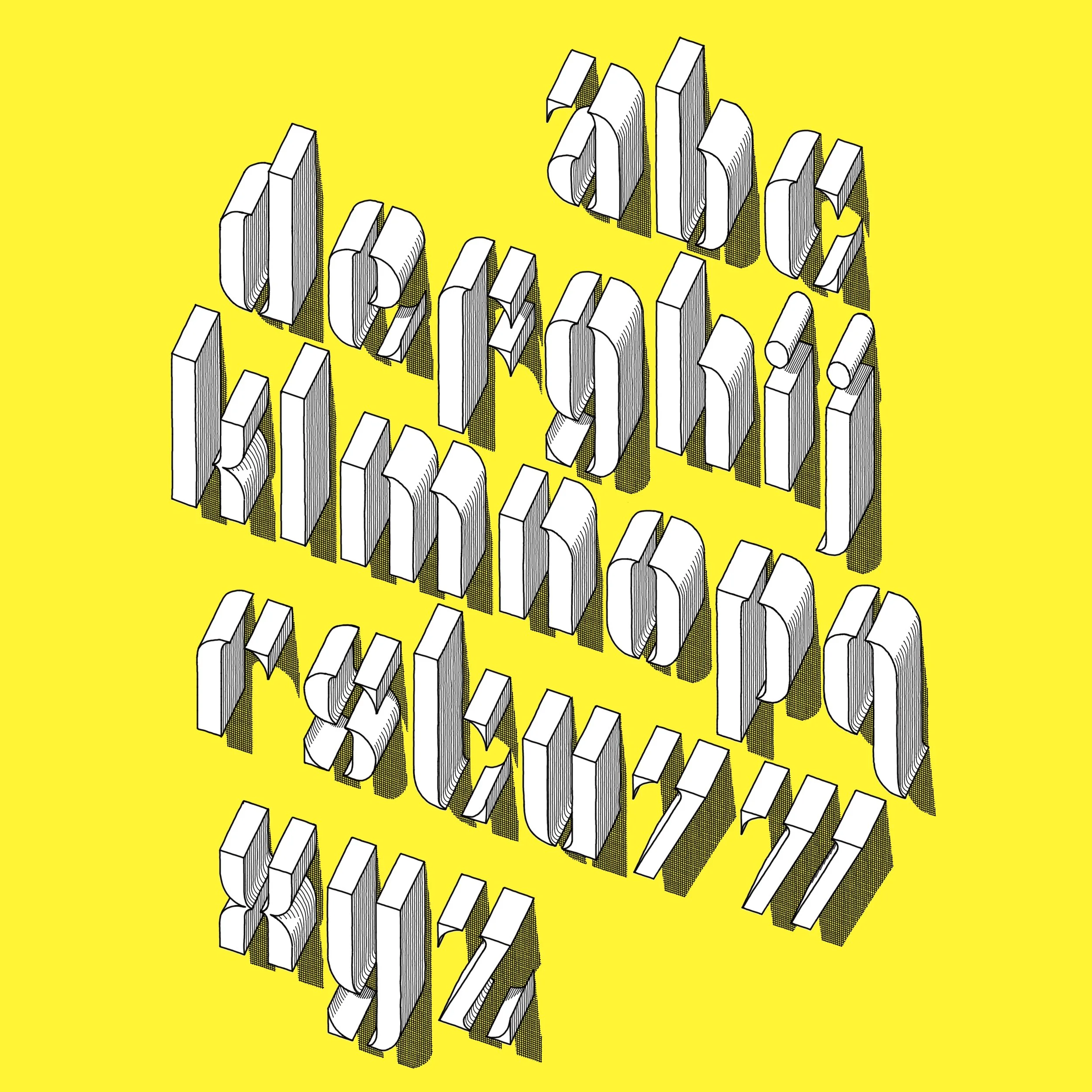
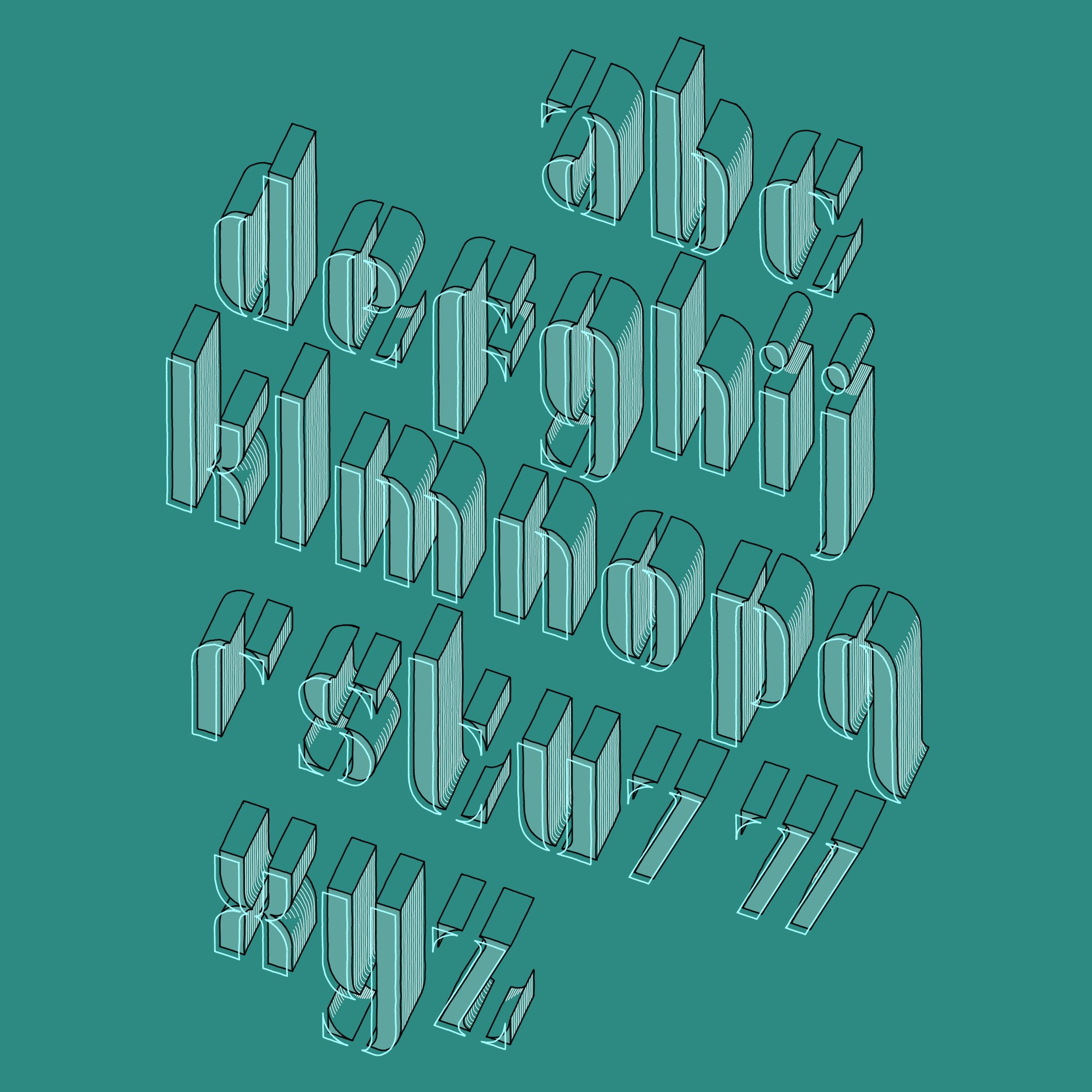
The first alphabet in my monthly series was inspired by a years-old memory: I used to travel to a project in Sutton regularly by train, and every time I would pass through Loughborough Junction Station my eye would be caught by an ancient advertising board, fixed to the flank wall of a building beside the tracks, for Snopake correction fluid.
The blocky three dimensional letters were so weathered by time that they were almost unintelligible, eroded to be more like pebbles or teeth.
I was always rather taken by its decayed beauty, and speculated to myself as to my chances of sneaking back one night and stealing it without getting caught: I didn’t fancy having to explain this peculiar design-crime to the investigating officers.
It may still be there, if anyone wants to steal it for me, though by now it is probably eroded beyond all recognition.
-
![]()
Lower case alphabet - main version
-
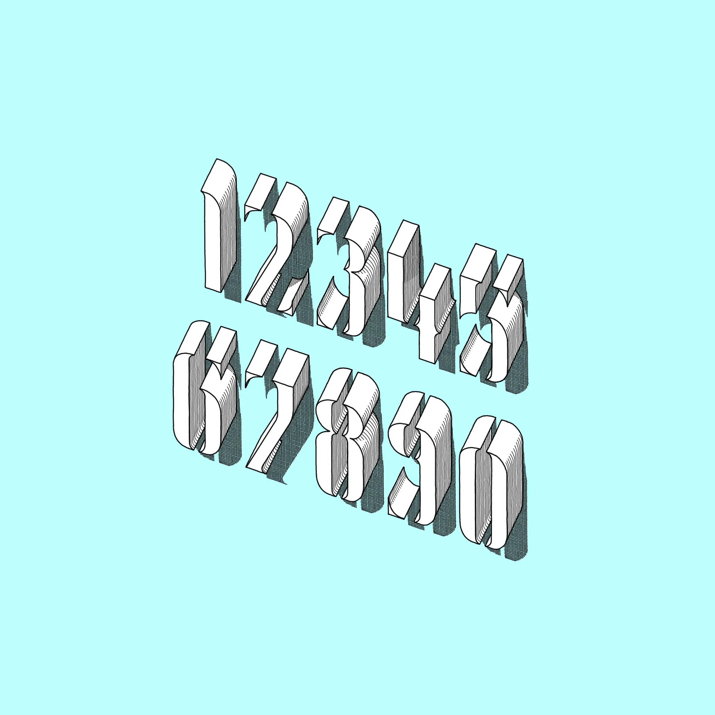
![]()
Numerals
-
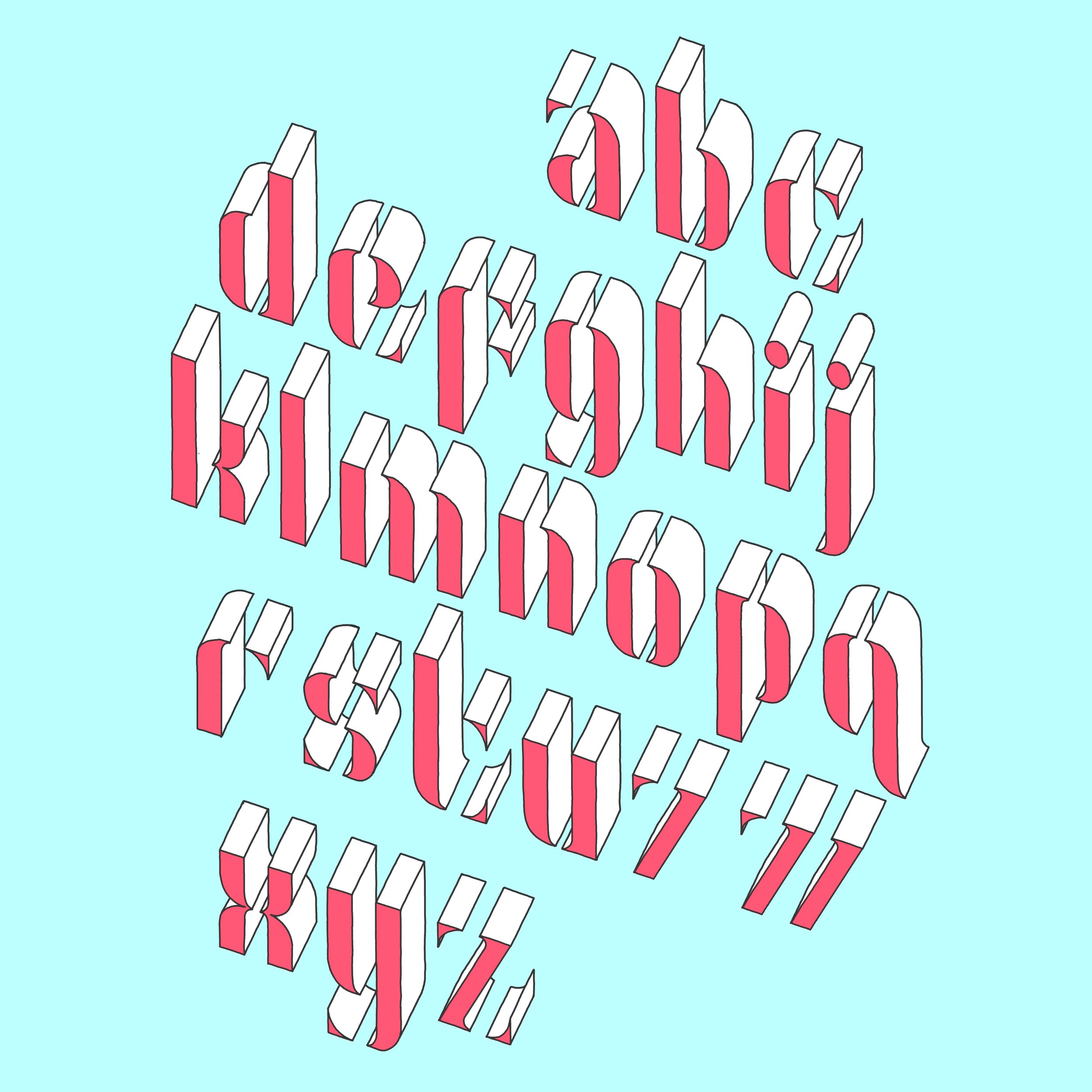
![]()
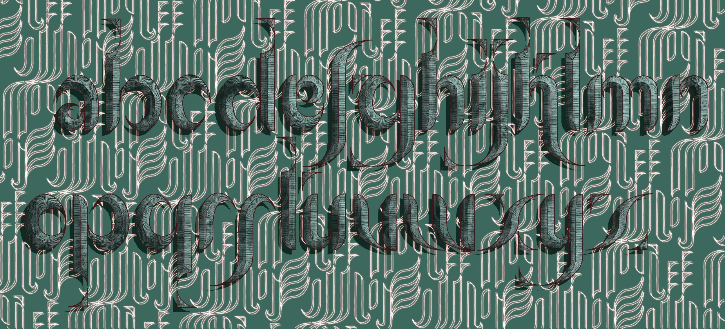
Lower case alphabet - variant 1
-
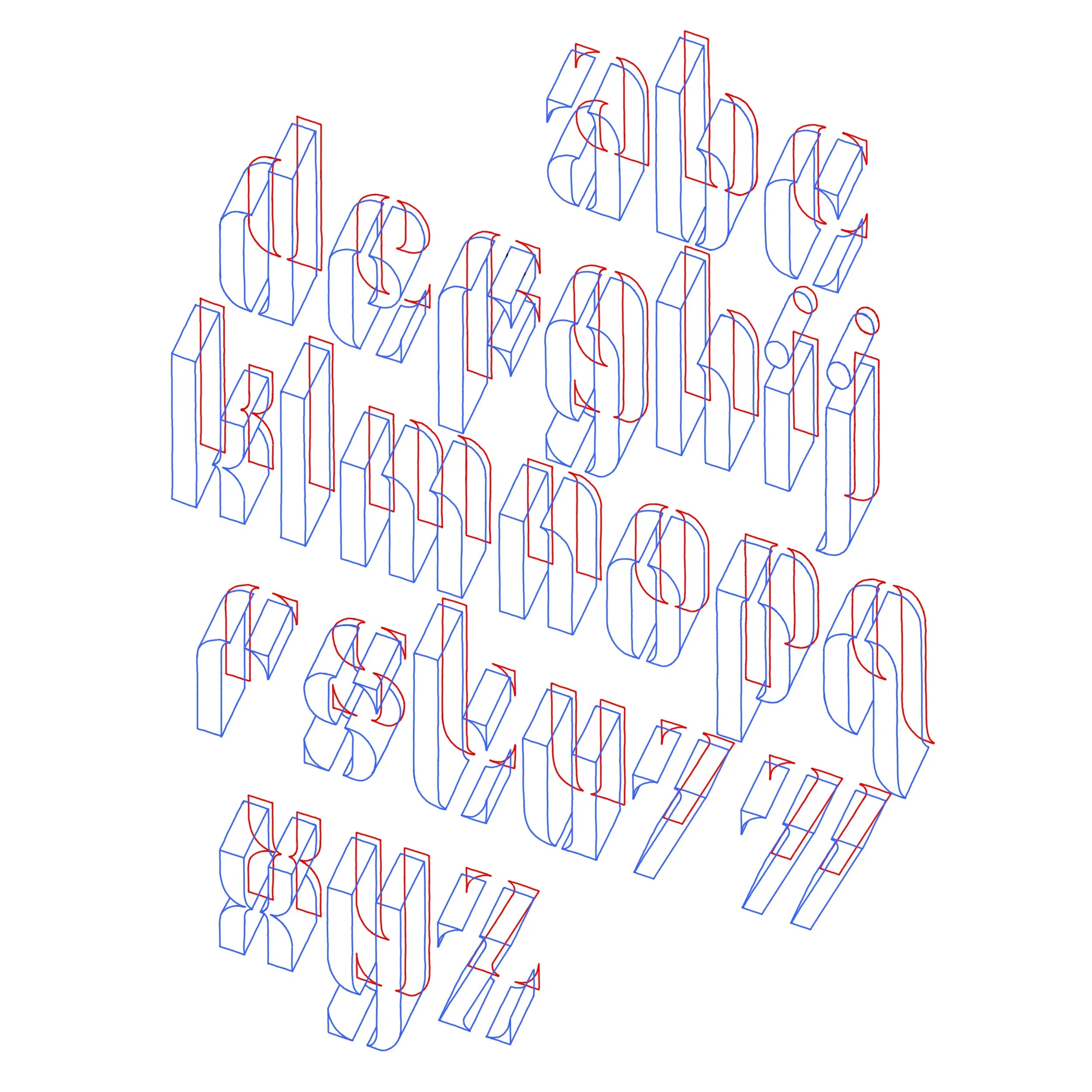
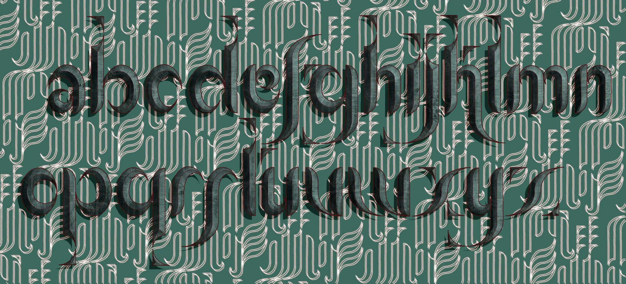
![]()
Lower case alphabet - variant 2
-
![]()
Lower case alphabet - variant 3
-
![]()
Lower case alphabet - variant 3