-
It’s getting pretty late in my Year of Alphabets, and though I’m pleased with the diversity of the approaches I’ve taken, I don’t think that they could really be deemed versatile. I have come to the conclusion that I am not the one who will produce the next Avenir or Palatino.
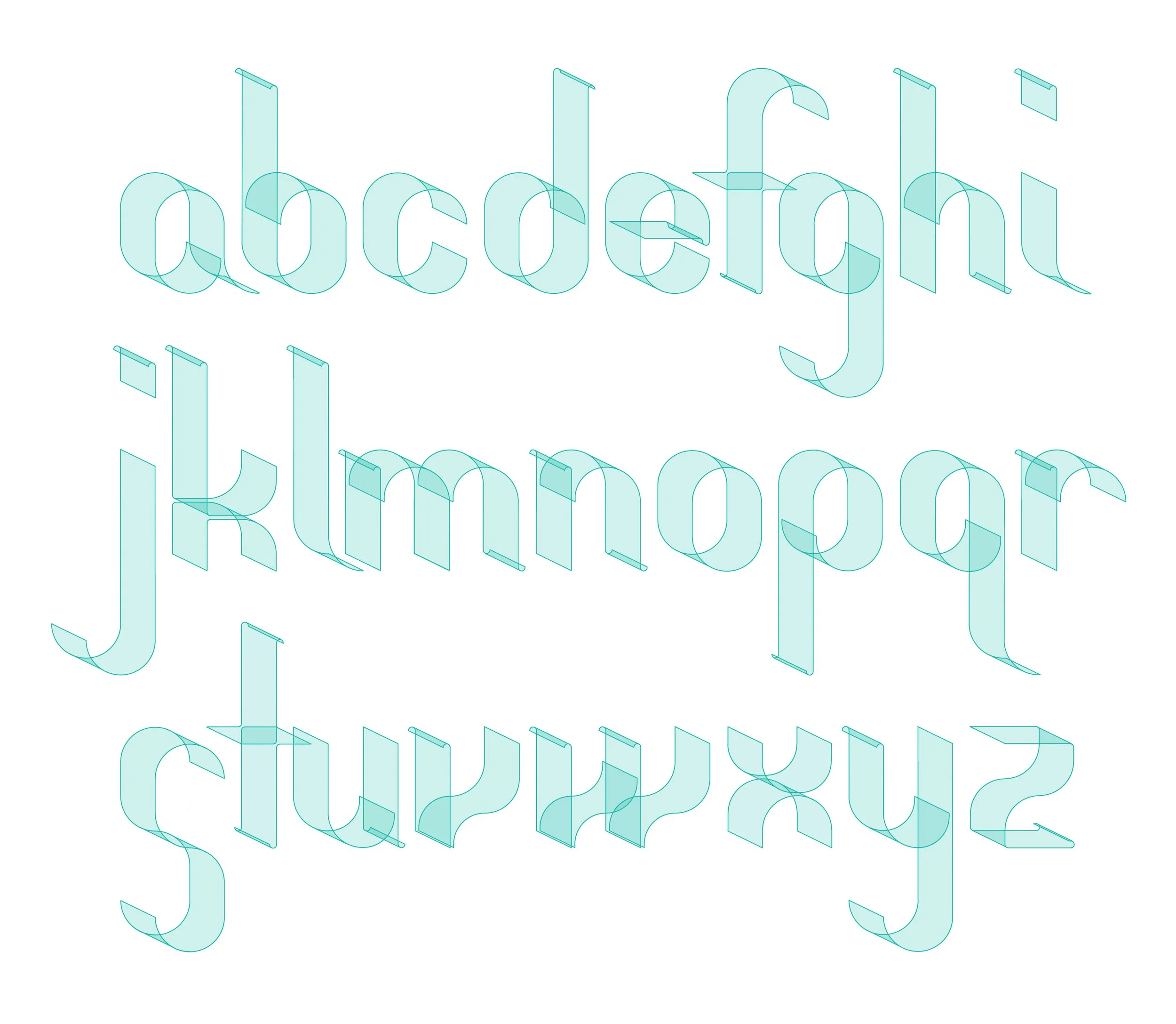
But versatility can take different forms - while I may not design anything that a graphic designer in their right mind would use for the body text of a book, November’s alphabet shows how a clean, standardised geometry with a distinctive character can lend itself to different uses.
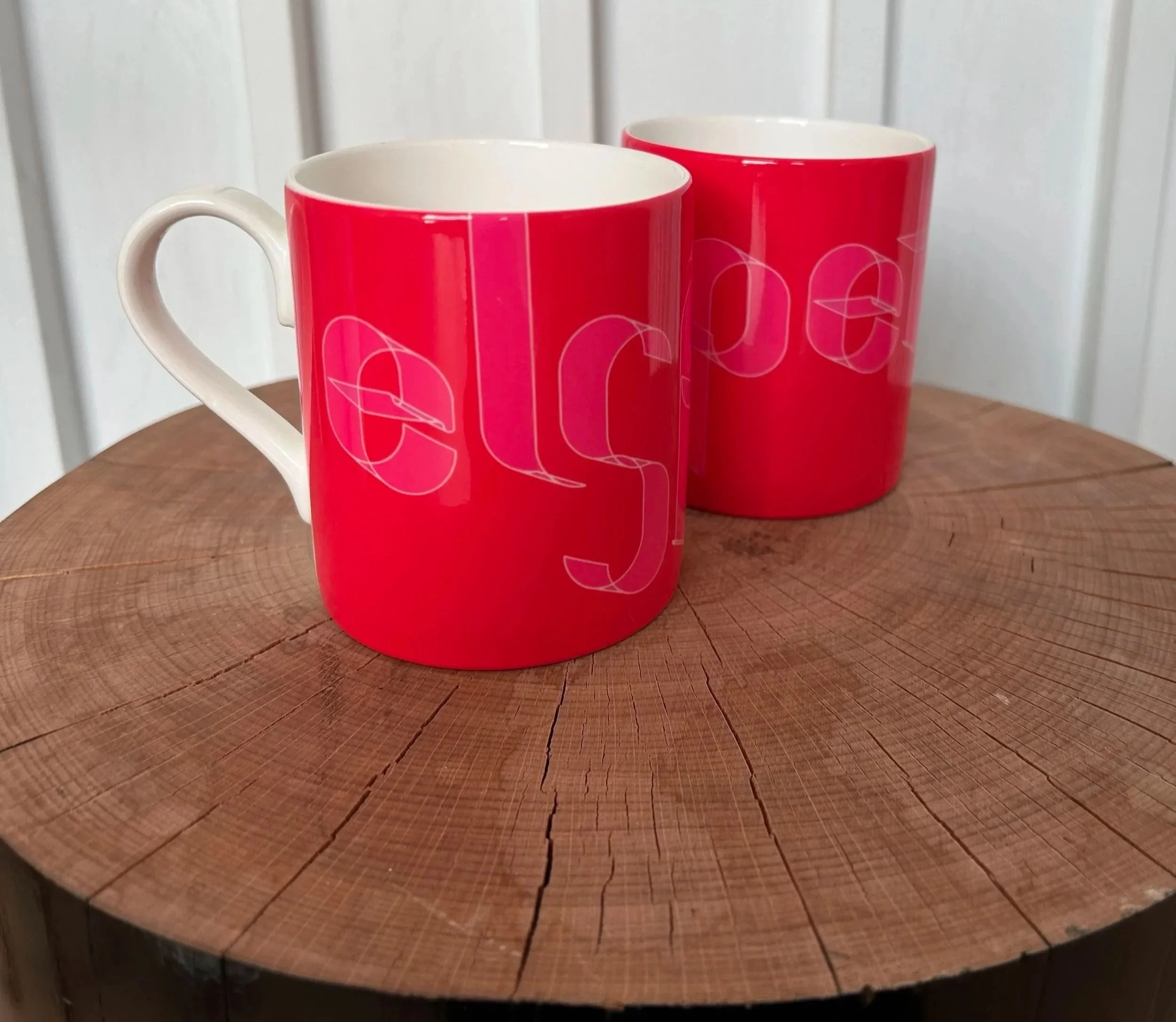
I developed this font specifically for use in material associated with my wife Elspeth’s recent significant birthday, building upon my understanding of her aesthetic preferences (i.e. not my more grotesque flights of fancy…).
It has worked well for use on mugs (she single-handedly supports the global tea industry through her consumption of that peculiar beverage) and as semi-abstract art. I think it’s been a success - she will now be subjected to new bespoke alphabets on an annual basis…
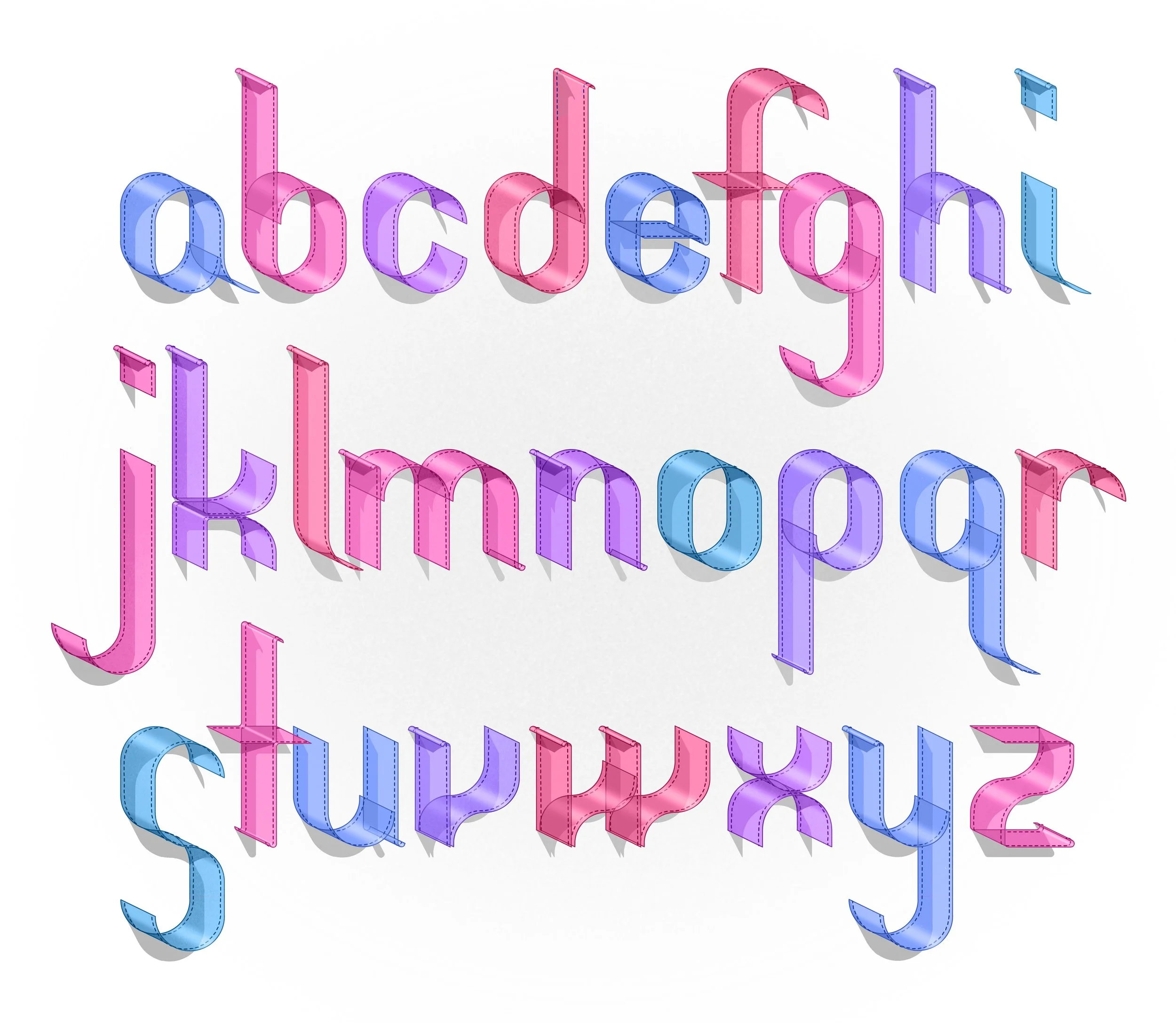
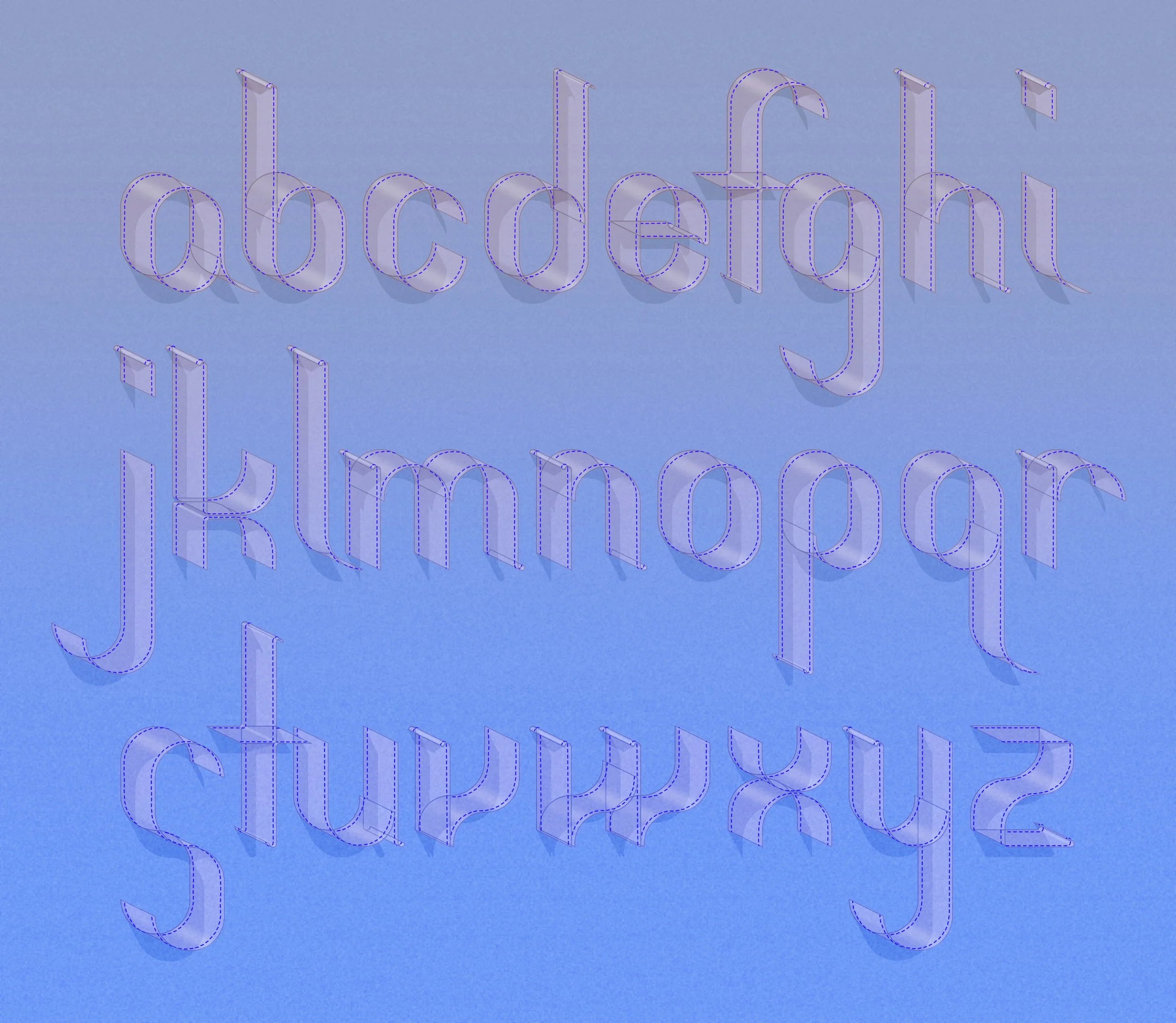
Year of Alphabets 9: November
-
![]()
Alternative colourway
-
![]()
Coloured ribbon variant
-
![]()
Translucent ribbon variant
-
![]()
Mug design using alphabet (present for my wife Elspeth who is amazingly tolerant of constantly receiving gifts adorned with my designs...)
November’s alphabet used for abstract composition (Birthday card design for my amazing wife Elspeth!)