-
For the final month of my Year of Alphabets (yes, I know that starting in March was confusing…) I have gone back to my roots - a font that is hand drawn (albeit still on my iPad) without any assistance from technology.
I find it useful to test myself in this manner from time to time to see if I can still achieve an acceptable standard of draughtsmanship. It gets harder, but I think I can still just about hack it.
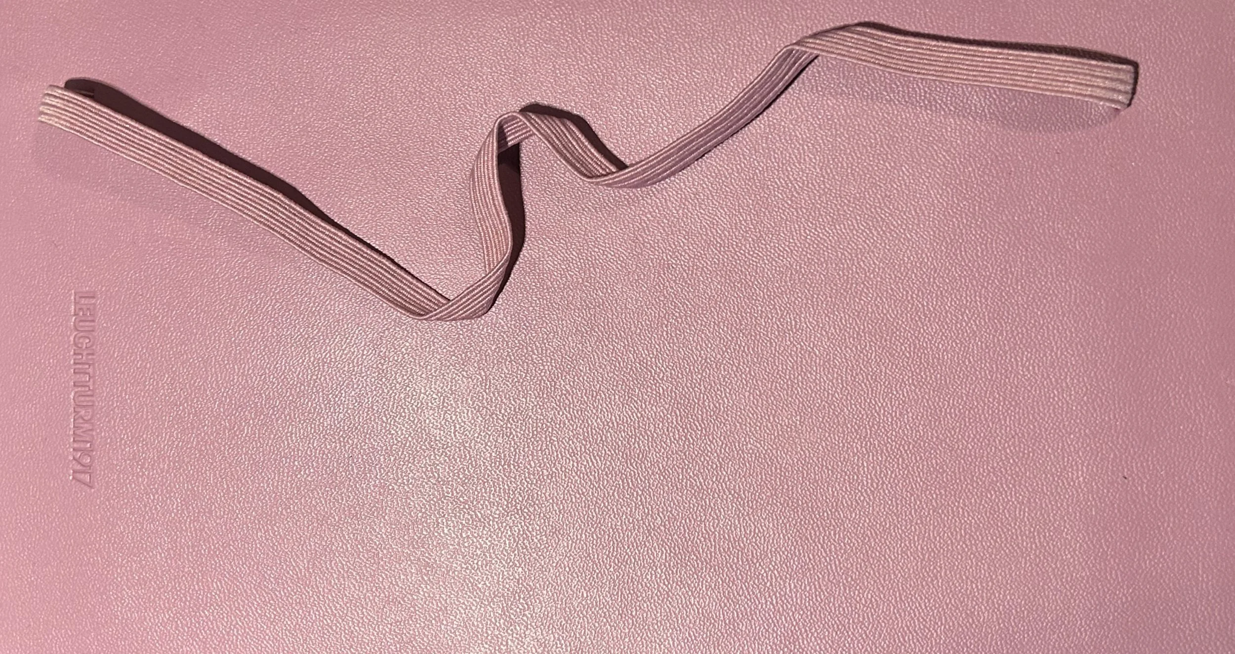
The font itself was inspired by, of all things, the elastic attached to a notebook. It is based on the visual conceit of a twisting band, passing through a translucent sheet that is perforated in a regular grid pattern, to form letters and words.
The linking sections on the far side of the sheet (which are reminiscent of the ligatures found in certain fonts) are a standard set, selected depending on the offset between the end of one letter and the start of the next (e.g. 2 grids down / one across etc.).
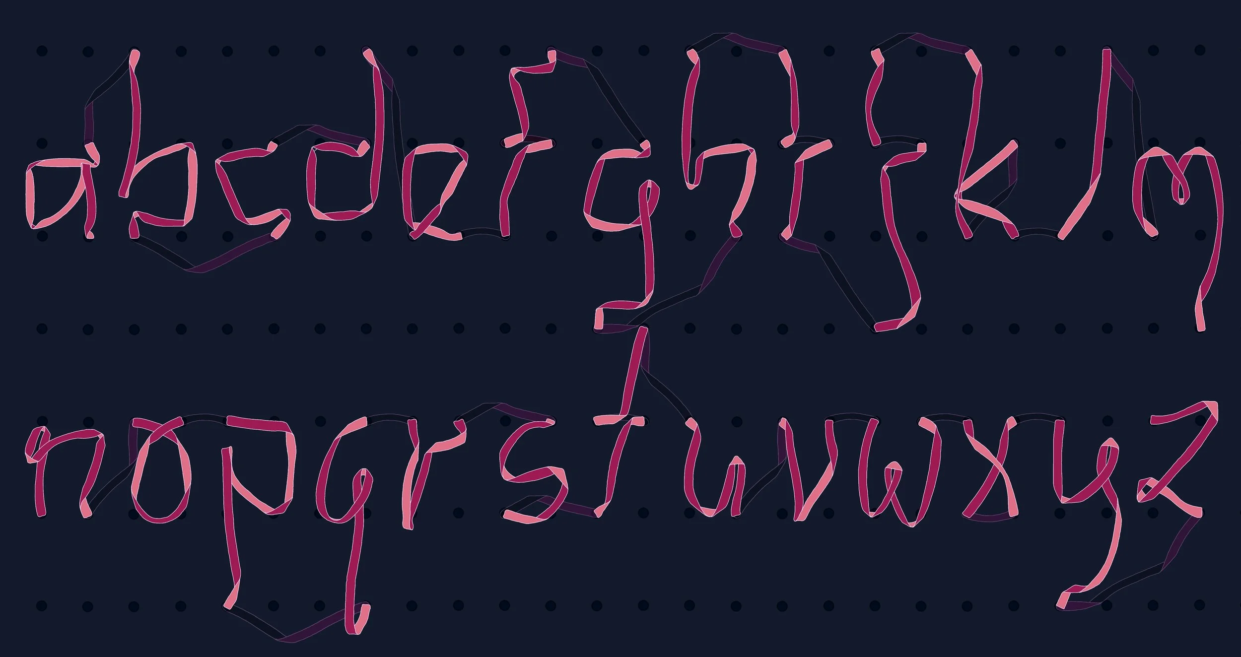
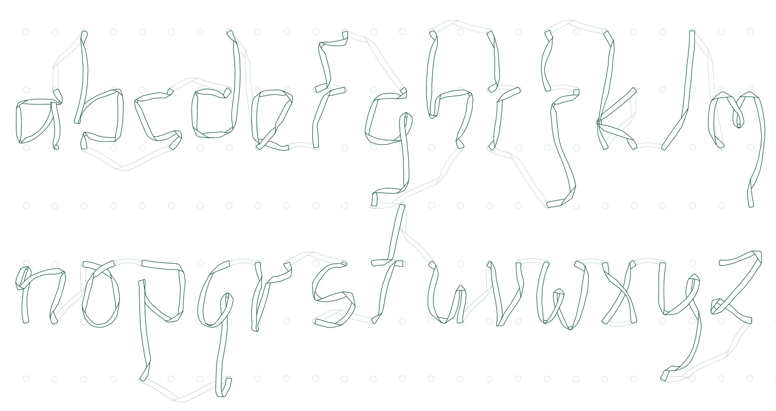
Year of Alphabets 12: February
Below: the alphabet
-
![]()
Alternative Colourway
-
![]()
Monochrome
-
![]()
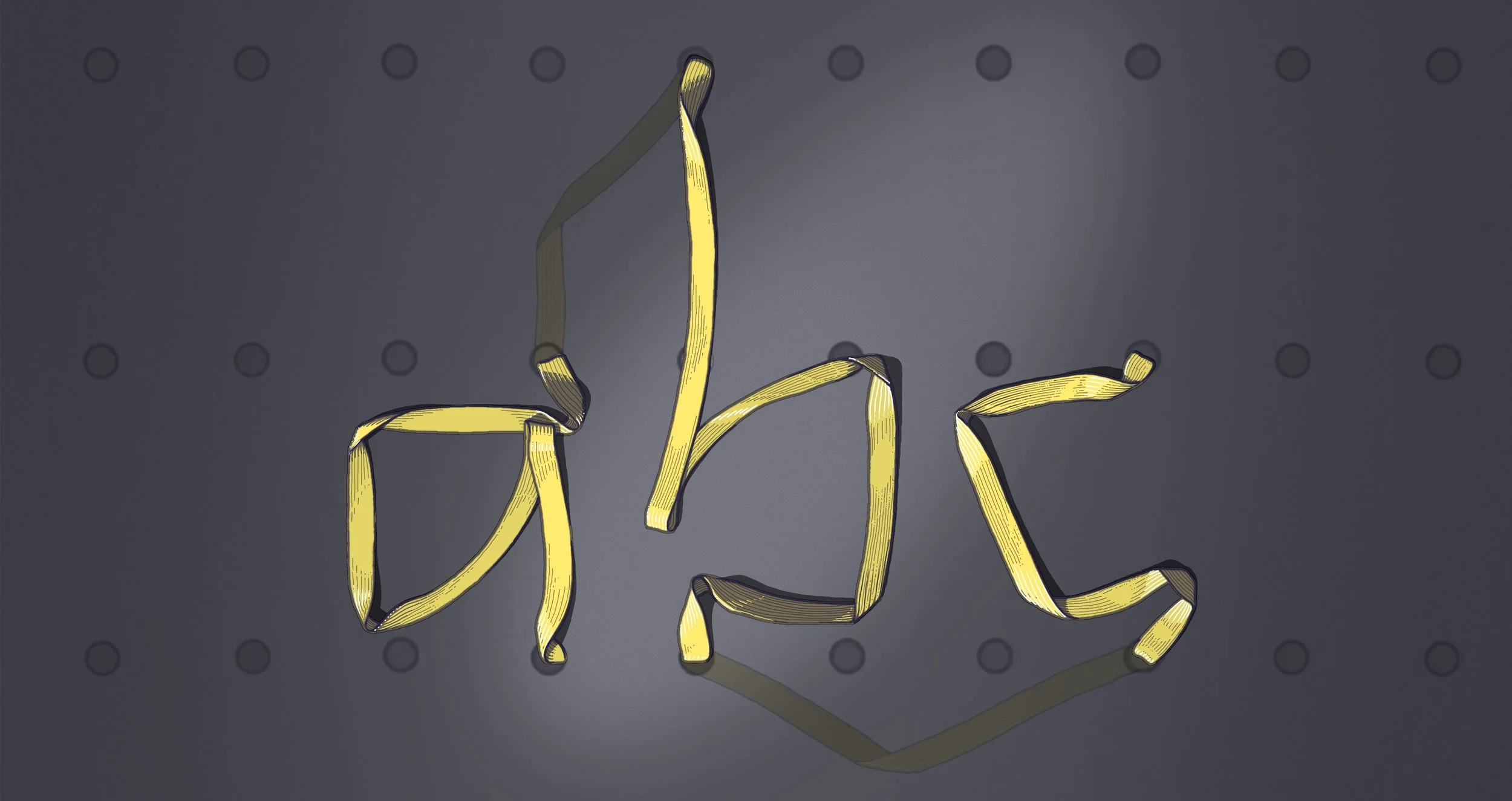
Shaded / Textured
-
![]()
Inspiration - a notebook